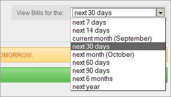
One of the better suggestions we received over the past year was concerning the way upcoming bills are displayed. In the old version of billQ, the upcoming bills page displayed the bill that needed to be paid next, regardless of how far into the future that bill was due.
Now, for the most part this made sense; but the problem was that you couldn't compartmentalize your expenses. You couldn't see the bills you needed to pay for just the next month, or for just the current month. Basically, the upcoming bills page was just a running tally.
Furthermore — and a testament to the importance of user experience — the act of paying a bill would result in the next bill in line immediately showing up. Once you paid rent for June, you were instantly hit with the bill for July. As some of you astutely put it, there was never the satisfaction of seeing all your bills for that period being completely paid. There was no real sense of accomplishment since you were always viewing the next bill in line right after you paid the previous one.

To solve this problem, we have included the ability to view your upcoming bills for specific periods (current month, next month, next 30 days, etc.). Not only does this help psychologically with the sysiphean task of keeping up with your bills, but it can also help you plan your cash flow. It's amazing how something so simple can help give you a clearer picture of what is due and when. It really helps with budgeting.
We've been using these viewing periods for a while and we're not sure how we ever got by without them. We think they will be of help to you as well.
What's on the plate for the next feature spotlight? Replying to Reminders.

